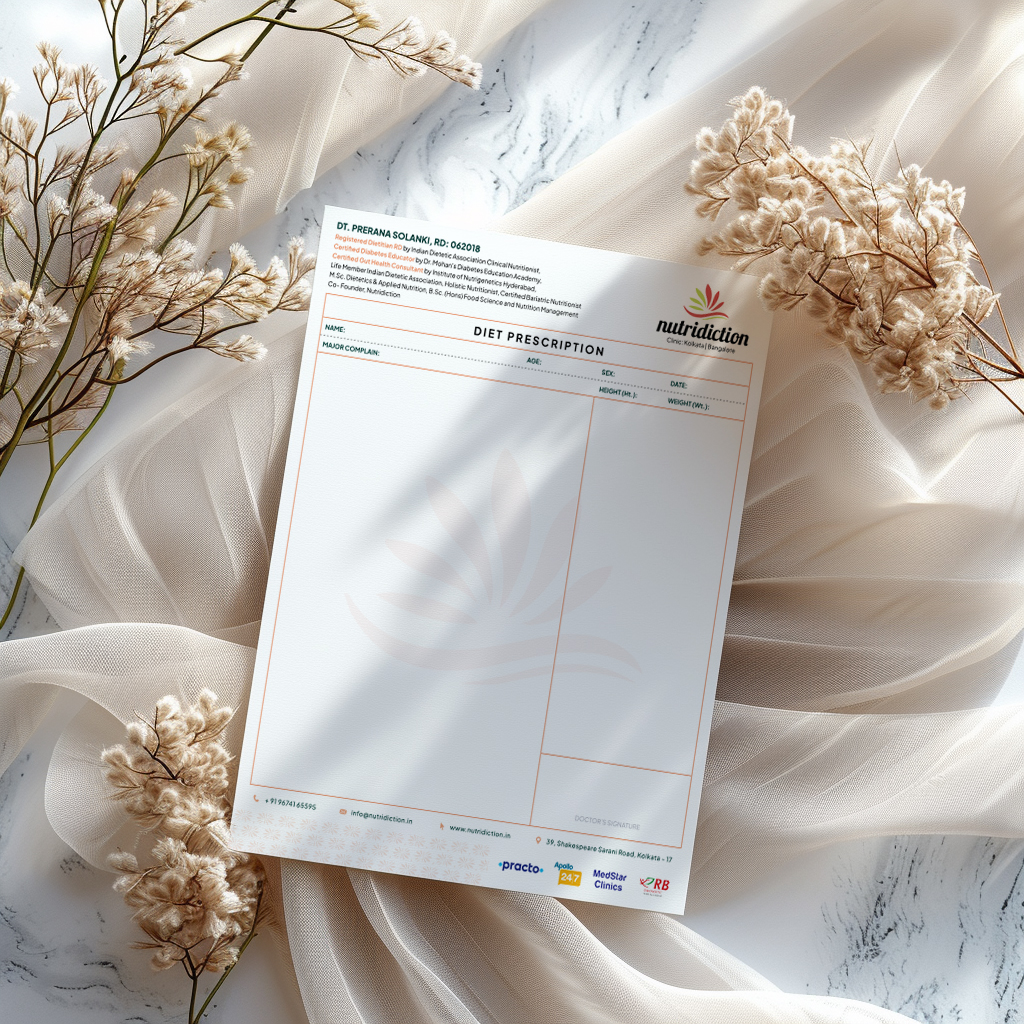
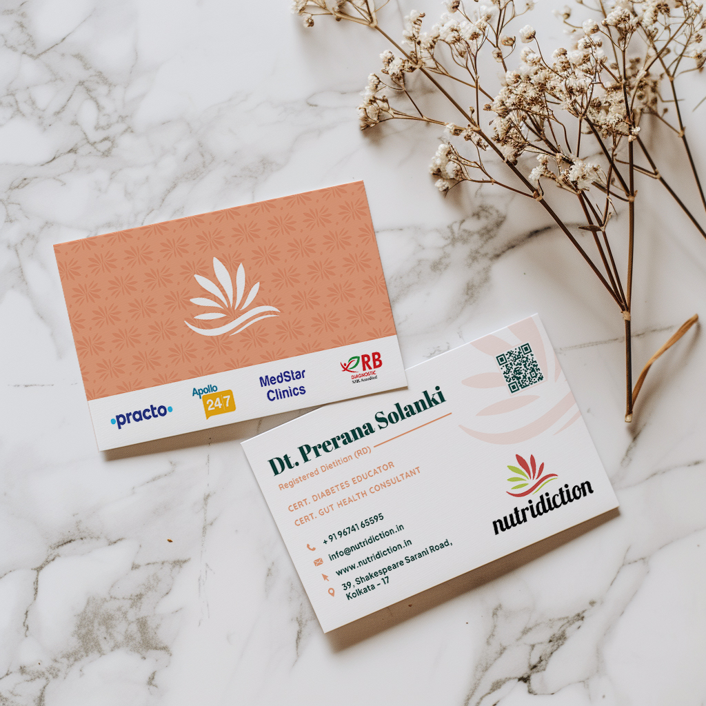
Prescription Pad and Visiting Card Design
“Got my prescription and visiting card designed from them. Very good quality work. They understand your inputs and give you the best creative suggestion. Will definitely recommend their services to others.”
P. Solanki – Founder
Project Overview
Objective:
To design a professional and visually appealing prescription pad and visiting card that reflect Nutridiction’s commitment to excellence and innovation in nutrition science.
Process:
- Client Consultation: We began with a detailed consultation to understand the client’s vision and requirements. This involved discussing their brand identity, the message they wanted to convey, and specific design preferences.
- Research and Concept Development: We delved into the latest design trends and best practices in medical and professional stationery. Our goal was to create designs that were not only aesthetically pleasing but also functional and reflective of the Nutridiction brand.
- Design Proposals: We presented multiple design concepts, incorporating creative suggestions and best practices. Each design was tailored to enhance the client’s professional image while ensuring ease of use and readability for their patients.
- Revisions and Finalization: We iterated on the designs based on client feedback, refining elements such as layout, color scheme, typography, and branding elements until the client was completely satisfied.
- Delivery: The final designs were delivered in high-quality formats suitable for printing and digital use, ensuring seamless integration into the client’s daily operations.
Deliverables:
- Prescription Pad Design:
- Features: Clear, organized layout with designated spaces for patient information, prescriptions, and additional notes.
- Design Elements: Incorporation of Nutridiction’s brand colors and logo for a cohesive professional look.
- Functionality: Easy-to-read format with ample writing space, enhancing both aesthetic appeal and practicality.
- Visiting Card Design:
- Features: Elegant design with essential contact information prominently displayed.
- Design Elements: Modern typography and Nutridiction’s branding for a professional, trustworthy appearance.
- Impact: Helps in establishing a strong first impression and facilitates seamless communication.
Our Solution:


