“Chinmay and his team nailed it! The branding is vibrant, the logo is genius, and the landing page communicates our vision perfectly. The attention to detail and creative support throughout the process made this journey seamless. Highly recommend them!”
Mailpecker – Team
Read on to discover the story behind Mailpecker’s branding and why it’s a game-changer in the marketing world.
Project Overview
About Mailpecker
Mailpecker is an advanced email marketing and building tool designed to help businesses create, manage, and optimize their email campaigns. With its user-friendly interface and powerful features, Mailpecker ensures businesses can target their audience with precision and achieve impactful results. Whether it’s designing stunning emails, tracking performance, or launching campaigns at scale, Mailpecker is the go-to solution for marketers looking to drive efficiency and engagement. Inspired by the relentless focus of a woodpecker, the tool embodies speed, consistency, and innovation in every aspect.
Task and Objective
The objective was to establish a distinctive and dynamic brand identity for Mailpecker, an email marketing and building tool. This involved creating a logo that embodies precision, speed, and consistency, designing a user-friendly landing page that effectively communicates the product’s benefits, and crafting versatile social media templates to kickstart their digital marketing efforts. The goal was to create a cohesive visual identity that resonates with Mailpecker’s core values and helps it stand out in a competitive market.


Meaning Behind the Logo
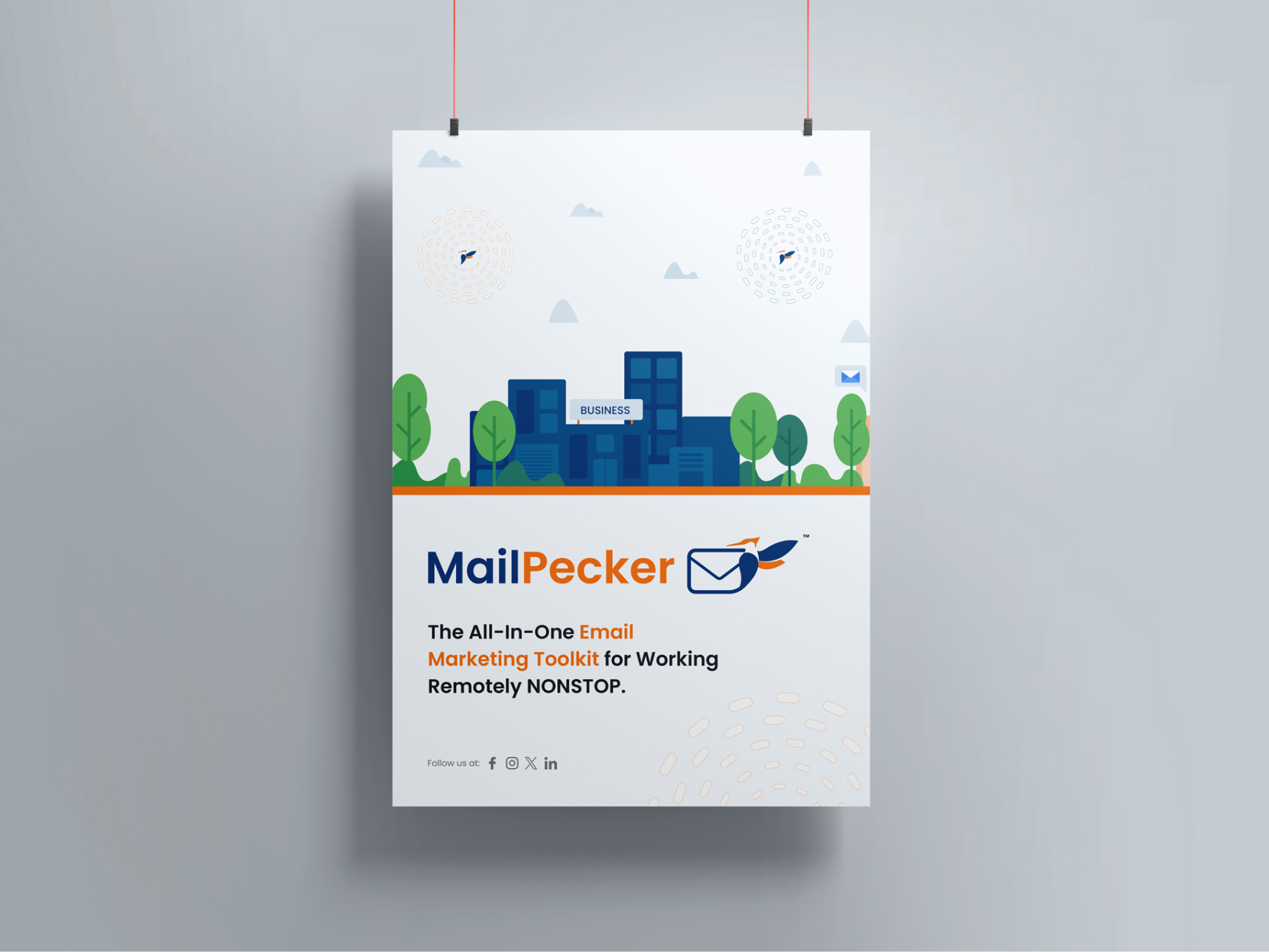
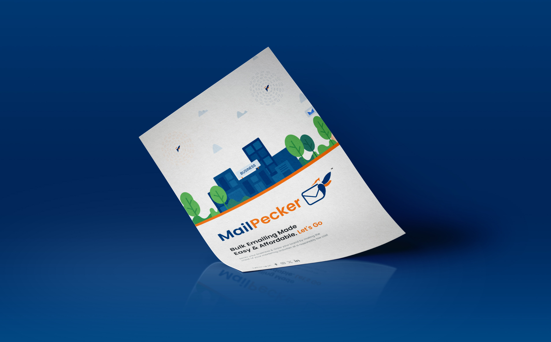
The logo is inspired by the woodpecker, known for its relentless focus and precision. Just as a woodpecker taps repeatedly at a single spot to achieve its goal, Mailpecker empowers businesses to target audiences with accuracy and speed. The streamlined design and energetic colors reflect the brand’s innovative and high-performance nature, making it memorable and meaningful.

Color Scheme
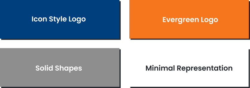
- White: Reflects simplicity, clarity, and focus.
- Orange: Represents energy, enthusiasm, and creativity.
- Blue: Symbolizes trust, reliability, and professionalism.

Typography
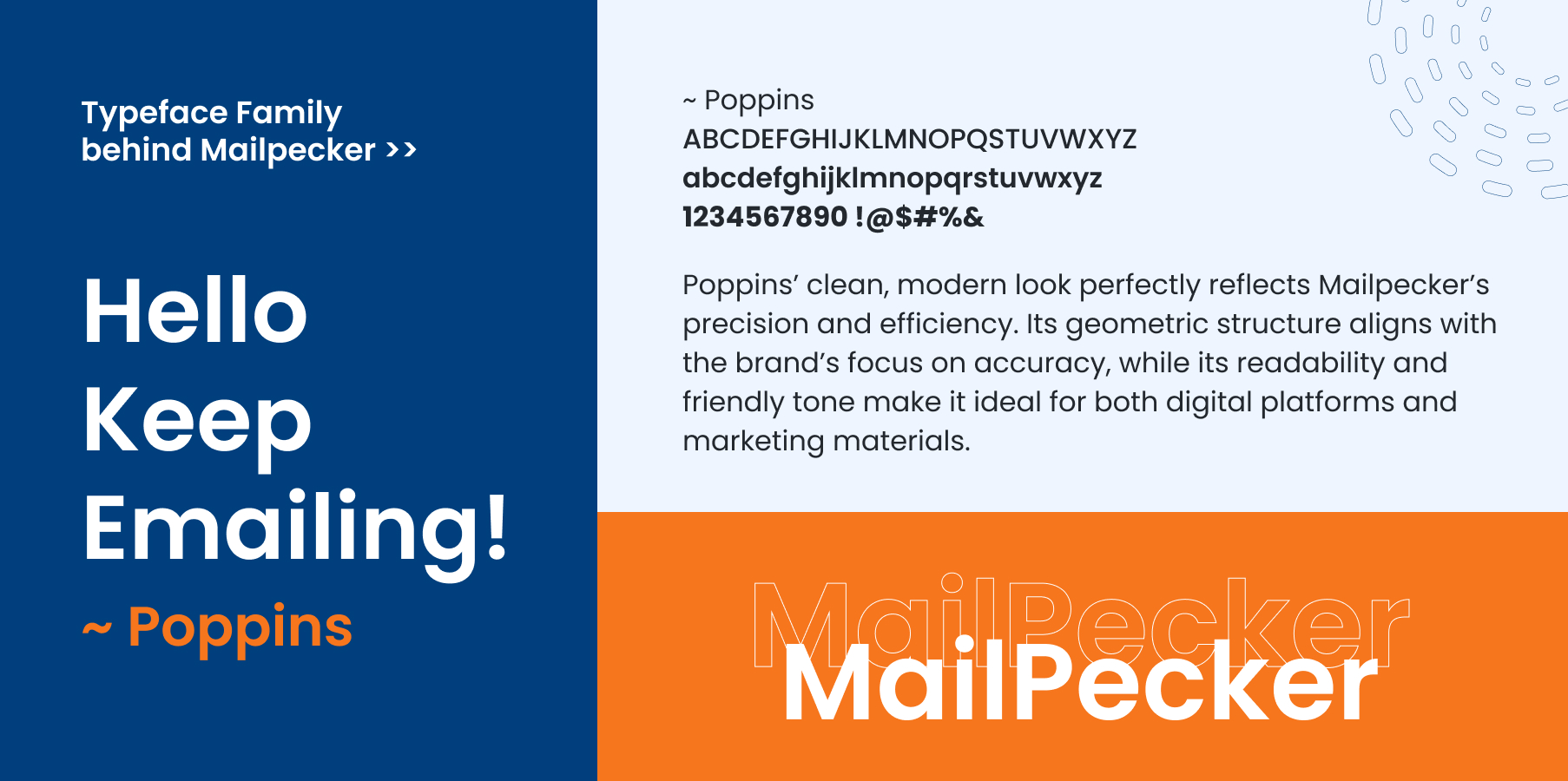
Poppins’ clean, modern look perfectly reflects Mailpecker’s precision and efficiency. Its geometric structure aligns with the brand’s focus on accuracy, while its readability and friendly tone make it ideal for both digital platforms and marketing materials.
Web Design
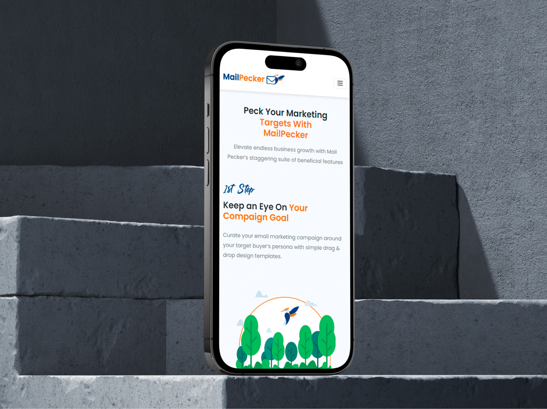
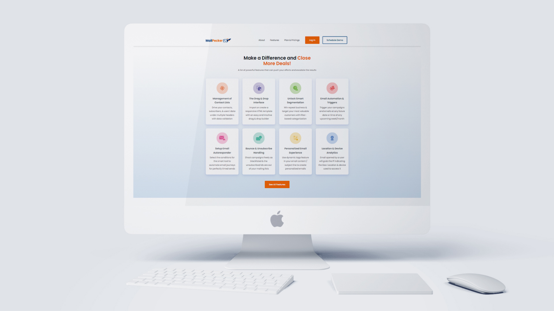
A user-friendly, modern landing page was crafted to highlight Mailpecker’s unique features and streamline the user journey. Designed with simplicity and functionality in mind, the landing page communicates the product’s core benefits while ensuring an engaging user experience.


Social Media Post Templates
To kickstart Mailpecker’s social media marketing efforts, we designed versatile and visually appealing post templates. These templates are aligned with the brand’s visual identity and cater to diverse marketing needs, ensuring consistency across platforms.


